Visualization
This is the documentation for visualization functions.
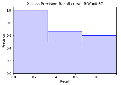
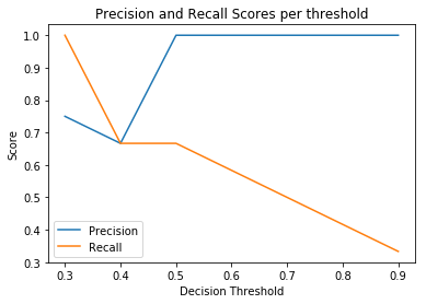
Precision Recall curve plot
- sam.visualization.plot_precision_recall_curve(y_true: array, y_score: array, range_pred: tuple | None = None, color: str = 'b', alpha: float = 0.2)
Create and return a precision-recall curve. It does this by putting the precision on the y-axis, the recall on the x-axis, and for each threshold, plotting that precision-recall. The function returns a subplot object that can be shown or edited further.
- Parameters:
- y_truenp.array, shape = (n_outputs,)
The truth values. Must be either 0 or 1. If range_pred is provided, this refers to the incidents.
- y_score: np.array, shape = (n_outputs,)
The prediction. Must be between 0 and 1
- range_predtuple, optional (default = None)
If this is provided, make a precision/incident recall plot, using y_true as the incidents, and this range_pred.
- color: string, optional (default=’b’)
The color the the plot. Default is blue
- alpha: float, optional (default=0.2)
The transparency of the solid part of the plot. The line will always be alpha 0.1, so if you just want the line, set this to 0.
- Returns:
- plot: matplotlib.axes._subplots.AxesSubplot object
a plot containing the resulting precision recall_curve. can be edited further, or printed to the output.
Examples
>>> from sam.visualization import plot_precision_recall_curve >>> y_true = np.array([0, 0, 1, 1, 1, 0]) >>> y_scores = np.array([0.1, 0.4, 0.35, 0.8, 0.2, 0.3]) >>> >>> fig = plot_precision_recall_curve(y_true, y_scores)
>>> # Incident recall curve >>> y_incidents = np.array([0, 0, 0, 0, 1, 0]) >>> fig2 = plot_precision_recall_curve(y_incidents, y_scores, (0, 2))
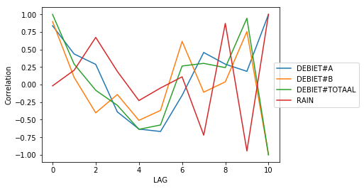
Autocorrelation plot
- sam.visualization.plot_lag_correlation(df: DataFrame, ylim_min: int | None = None, ylim_max: int | None = None)
Visualize the correlations for rolling features
- Parameters:
- df: pandas dataframe (columns: LAG and columns to visualise)
Dataframe containing the data that has to be visualized.
- ylim_min: int (default = None)
minimun for customizing the y-axis limit.
- ylim_max: int (default = None)
maximum for customizing the y-axis limit.
- Returns:
- ax: seaborn plot
Plot containing the visualization of the data
Examples
>>> import pandas as pd >>> from sam.feature_engineering import BuildRollingFeatures >>> from sam.exploration import lag_correlation >>> from sam.visualization.rolling_correlations import plot_lag_correlation >>> import numpy as np >>> goal_feature = 'DEBIET#TOTAAL' >>> df = pd.DataFrame({ ... 'RAIN': [0.1, 0.2, 0.0, 0.6, 0.1, 0.0, ... 0.0, 0.0, 0.0, 0.0, 0.0, 0.0], ... 'DEBIET#A': [1, 2, 3, 4, 5, 5, 4, 3, 2, 4, 2, 3], ... 'DEBIET#B': [3, 1, 2, 3, 3, 6, 4, 1, 3, 3, 1, 5]}) >>> df['DEBIET#TOTAAL'] = df['DEBIET#A'] + df['DEBIET#B'] >>> test = lag_correlation(df, goal_feature) >>> f = plot_lag_correlation(test)
Threshold curve plot
- sam.visualization.plot_threshold_curve(y_true: array, y_score: array, range_pred: tuple | None = None)
Create and return a threshold curve, also known as Ynformed plot. It does this by putting the threshold on the x-axis, and for each threshold, plotting the precision and recall. This returns a subplot object that can be shown or edited further.
- Parameters:
- y_true: array_like, shape = (n_outputs,)
The actual values. Values must be either 0 or 1. If range_pred is provided, this refers to the incidents.
- y_score: array_like, shape = (n_outputs,)
The prediction. Values must be between 0 and 1
- range_pred: tuple, optional (default = None)
If provided, make a precision/incident recall plot, using y_true as the incidents, and this range_pred.
- Returns:
- plot: matplotlib.axes._subplots.AxesSubplot object
a plot containing the resulting precision threshold plot. can be edited further, or printed to the output.
Examples
>>> from sam.visualization import plot_threshold_curve >>> plot_threshold_curve([0, 1, 0, 1, 1, 0], [.2, .3, .4, .5, .9, .1])
>>> # Incident recall threshold plot >>> plot_threshold_curve( ... [0, 0, 0, 0, 1, 0], [.2, .3, .4, .5, .9, .1], (0, 1) ... )
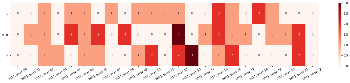
Incident heatmap plot
- sam.visualization.plot_incident_heatmap(df: DataFrame, resolution: str = 'row', row_column: str = 'id', value_column: str = 'incident', time_column: str | None = None, normalize: bool = False, figsize: Iterable[Tuple[int, int]] = (24, 4), xlabel_rotation: int = 30, datefmt: str | None = None, **kwargs)
Create and return a heatmap for incident occurence. This can be used to visualize e.g. the count of outliers/threshold surpassings/warnings given over time. This returns a subplot object that can be shown or edited further.
- Parameters:
- df: Pandas DataFrame
Contains the data to be plotted in long format
- resolution: string (default=”row”)
The aggregation level to be plotted. Is either “row” when every row needs to be plotted, or e.g. H, D, W, M for aggregations over time.
- row_column: string (default=”id”)
The column that used to split the rows of the heatmap
- value_column: string (default=”incident”)
The column containing the count to be plotted in the heatmap
- time_column: string (default=None)
The column containing the time for the x-axis. When left None, the index will be used. Aggregation based on the resolution parameter is done on this column.
- normalize: boolean (default=False)
Normalize the aggregated values
- figsize: tuple of floats (default=(24,4))
Size of the output figure, must be set before initialization.
- xlabel_rotation: numeric, optional (default=30)
The rotation of the x-axis date labels. Rotation is counterclockwise, beginning with the text lying horizontally. By default, rotate 30 degrees.
- datefmt: string, optional (default=None)
Optionally, the format of the x-axis date labels. By default, use %Y-%m-%dT%H:%M:%S%f
- **kwargs:
any arguments to pass to sns.heatmap()
- Returns:
- plot: matplotlib.axes._subplots.AxesSubplot object
a plot containing the heatmap. Can be edited further, or printed to the output.
Examples
>>> from sam.visualization import plot_incident_heatmap >>> import pandas as pd >>> import numpy as np >>> # Initialize a random dataframe >>> rng = pd.date_range('1/1/2011', periods=150, freq='D') >>> ts = pd.DataFrame({'values': np.random.randn(len(rng)), ... 'id': np.random.choice(['A','B','C'], len(rng))}, ... index=rng, columns=['values','id']) >>> >>> # Create some incidents >>> ts['incident'] = 0 >>> ts.loc[ts['values'] > .5, 'incident'] = 1 >>> >>> # Create the heatmap >>> fig = plot_incident_heatmap( ... ts, resolution='W', annot=True, cmap='Reds', datefmt="%Y, week %W" ... )
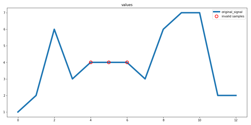
Flatline Removal plot
- sam.visualization.diagnostic_flatline_removal(flatline_validator: FlatlineValidator, raw_data: DataFrame, col: str)
Creates a diagnostic plot for the extreme value removal procedure.
Parameters:
- flatline_validator: sam.validation.FlatlineValidator
fitted FlatlineValidator object
- raw_data: pd.DataFrame
non-transformed data
- col: string
column name to plot
Returns:
- fig: matplotlib.pyplot.figure
diagnostic plot
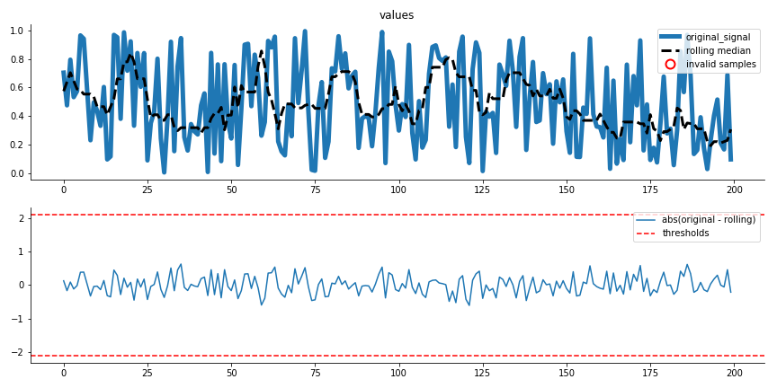
Extreme value removal plot
- sam.visualization.diagnostic_extreme_removal(mad_validator: MADValidator, raw_data: DataFrame, col: str)
Creates a diagnostic plot for the extreme value removal procedure.
Parameters:
- mad_validator: sam.validation.MADValidator
fitted MADValidator object
- raw_data: pd.DataFrame
non-transformed data data
- col: string
column name to plot
Returns:
- fig: matplotlib.pyplot.figure
diagnostic plot
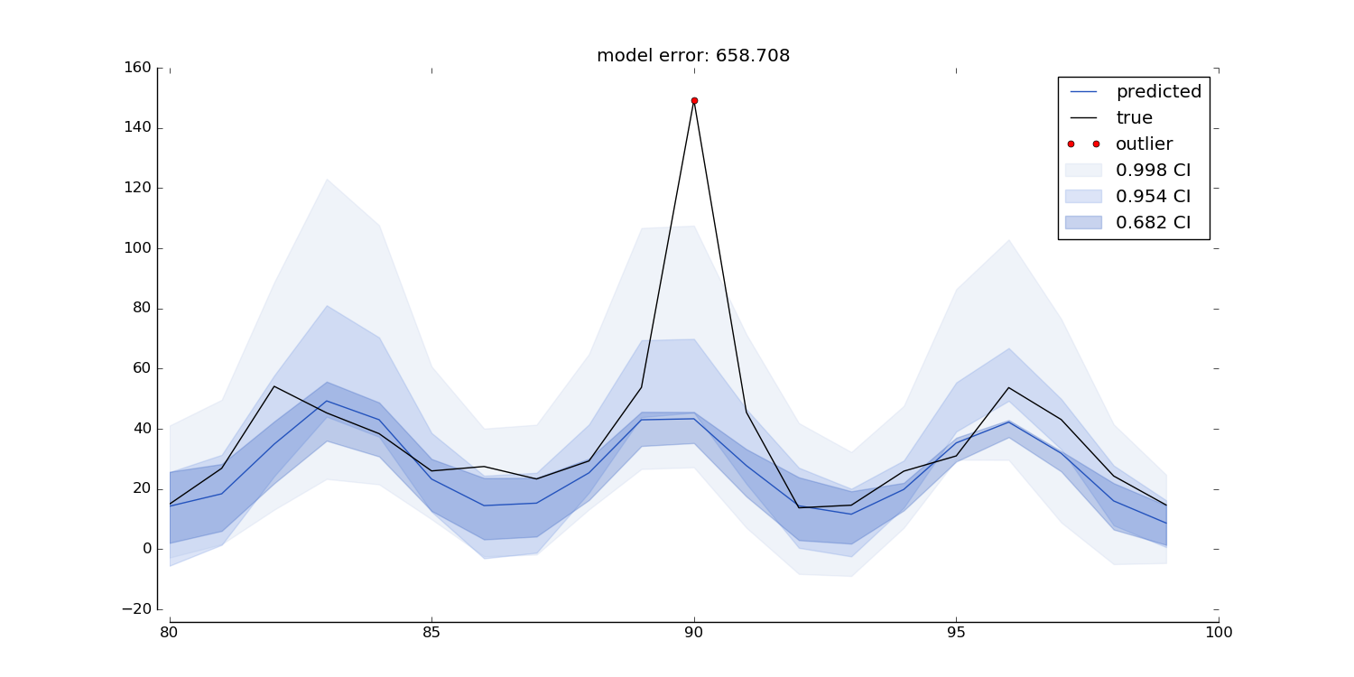
Quantile Regression plot
- sam.visualization.sam_quantile_plot(y_true: Series, y_hat: DataFrame, title: str | None = None, y_title: str = '', data_prop: int | None = None, y_range: int | None = None, date_range: list | None = None, colors: list = ['#2453bd', '#7497e3', '#c3d0eb', '#d1d8e8'], outlier_min_q: int | None = None, predict_ahead: int = 0, res: str | None = None, interactive: bool = False, outliers: ndarray | None = None, outlier_window: int = 1, outlier_limit: int = 1, ignore_value: float | None = None, benchmark: DataFrame | None = None, benchmark_color: str = 'purple')
Uses the output from MLPTimeseriesRegressor predict function to create a quantile prediction plot. It plots the actual data, the prediction, and the quantiles as shaded regions. The plot displays a single prediction per timepoint (e.g. made 10 timepoints ago). The plot can be made for any predict_ahead, and can be resampled to any time-resolution. The plot also highlights outliers as all true values that fall outside the `outlier_min_q`th quantile.
Note: this function only works when an even number of quantiles was used in the fit procedure!
Parameters
- y_true: pd.Series
Pandas Series containing the actual values. Should have same index as y_hat.
- y_hat: pd.DataFrame
Dataframe returned by the MLPTimeseriesRegressor .predict() function. Columns should contain at least predict_lead_x_mean, where x is predict ahead and for each quantile: predict_lead_x_q_y where x is the predict_ahead, and y is the quantile. So e.g.: [‘predict_lead_0_q_0.25, predict_lead_0_q_0.75, predict_lead_mean’]
- title: string (default=None)
Title for the plot.
- y_title: string (default=’’)
Title to put along the yaxis (ylabel).
- data_prop: int (default=None)
Proportion of data range to include outside true data maxima for plot range, if not set to None. This is only applied if y_range is None.
- y_range: list or None (default=None)
The minimum and maximum for the y-axis if not set to None.
- date_range: list (default=None)
The minimum and maximum date for the x-axis if not set to None. e.g.:[‘2019-11-13’, ‘2019-11-26’]
- colors: list of strings (default=[‘#2453bd’, ‘#7497e3’, ‘#c3d0eb’])
should be a valid colorstring for each quantile (first in list is narrowest quantile etc.)
- outlier_min_q: int (default=None)
Outlier number to use for determining ‘invalid’ samples. 1 indicates the narrowest CI. If 3 quantiles are used in the fit procedure, this can be either 1, 2, or 3. In this situation, if outlier_min_q is set to 3, all true values that fall outside of the third quantile are highlighted in the plot. Cannot be used in conjunction with outliers.
- predict_ahead: int (default=0)
Number of samples ago that prediction was made. Should be one that was included in the MLPTimeseriesRegressor fit procedure.
- res: string (default=None)
Time resolution to resample data to. Should be interpretable by pandas resamples (e.g. ‘5min’, ‘1D’ etc.). For this to work, the data must have datetime indices.
- interactive: bool (default=False)
Returns a matplotlib figure if False, otherwise returns a plotly figure.
- outliers: array-like (default=None)
Alternatively to the outlier_min_q argument, you can pass a boolean array of outliers here. This allows the user to specify their own rules that determine whether a sample is an outlier or not. Should be same length as y_hat, and should either have same index, or no index at all (np array) or list. Cannot be used in conjunction with outlier_min_q.
- outlier_window: int (default=1)
the window size in which at least outlier_limit should be outside of outlier_min_q
- outlier_limit: int (default=1)
the minimum number of outliers within outlier_window to be outside of outlier_min_q
- ignore_value: float (default=None)
value to ignore during resampling (e.g. 0 for pumps that often go off)
- benchmark: pd.DataFrame
The benchmark used to determine R2 of y_hat, for example a dataframe returned by the MLPTimeseriesRegressor.predict() function. Columns should contain at least predict_lead_x_mean, where x is predict ahead and for each quantile: predict_lead_x_q_y where x is the predict_ahead, and y is the quantile. So e.g.: [‘predict_lead_0_q_0.25, predict_lead_0_q_0.75, predict_lead_mean’]
- benchmark_color: string (default=’purple’)
a valid colorstring for the benchmark line/scatter color
Returns
fig: matplotlib.pyplot.figure if interactive=False else go.Figure
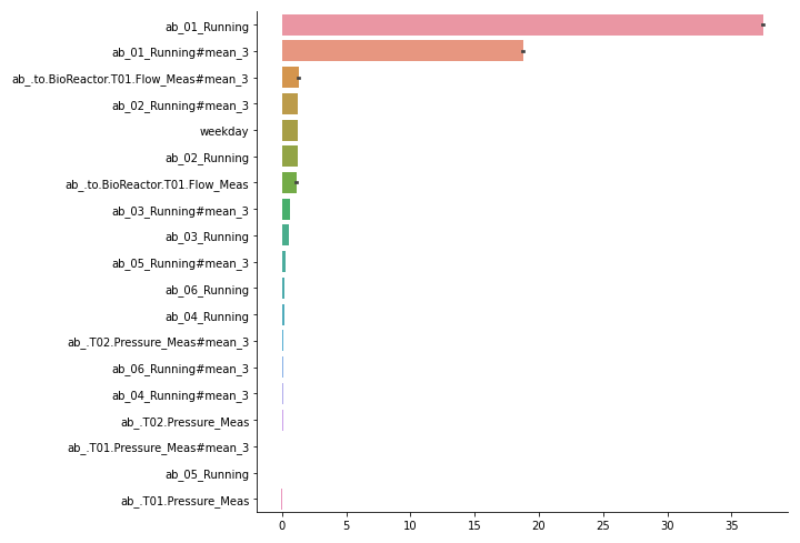
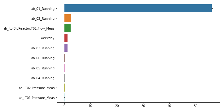
Feature importances plot
- sam.visualization.plot_feature_importances(importances: DataFrame, feature_names: Iterable | None = None)
Create bar graph of feature importances, with highest first. Also creates aggregated features over lag features. For this, pass a list of features as feature_names. It accepts the output of MLPTimeseriesRegressor.quantile_feature_importances(). Alternatively, you can format your own feature importances as a pandas DataFrame with columns as features and rows as potentially multiple random iterations.
- Parameters:
- importances: pd.DataFrame
Dataframe with features as columns and potentially multiple random iterations as rows.
- feature_names: iterable of strings or None (default=None)
Iterable of column names (or starting column names) to aggregate for. Every element of feature_names is the common start name of each feature, i.e.: importances for feature_1#lag_1 and feature_1#lag3 are summed.
- Returns:
- fig: matplotlib.pyplot.Figure
Bar plot of all features in importances. Error bars indicate variance over iterations
- fig_sum: matplotlib.pyplot.Figure
Bar plot with feature importances summed over lag features. Error bars indicate variance over iterations.
Examples
>>> # One way to get to feature importances is to first fit a MLPTimeseriesRegressor. >>> # In this example, we assumed you did and refer to it as `model`. >>> from sam.visualization import plot_feature_importances >>> # note that we need a negative here, as default score function is a loss >>> # Example with a fictional dataset with only 2 features >>> import pandas as pd >>> import seaborn >>> from sam.models import MLPTimeseriesRegressor >>> from sam.feature_engineering import SimpleFeatureEngineer >>> from sam.datasets import load_rainbow_beach ... >>> data = load_rainbow_beach() >>> X, y = data, data["water_temperature"] >>> test_size = int(X.shape[0] * 0.33) >>> train_size = X.shape[0] - test_size >>> X_train, y_train = X.iloc[:train_size, :], y[:train_size] >>> X_test, y_test = X.iloc[train_size:, :], y[train_size:] ... >>> simple_features = SimpleFeatureEngineer( ... rolling_features=[ ... ("wave_height", "mean", 24), ... ("wave_height", "mean", 12), ... ], ... time_features=[ ... ("hour_of_day", "cyclical"), ... ], ... keep_original=False, ... ) ... >>> model = MLPTimeseriesRegressor( ... predict_ahead=(0,), ... feature_engineer=simple_features, ... verbose=0, ... ) ... >>> model.fit(X_train, y_train) <keras.callbacks.History ... >>> score_decreases = model.quantile_feature_importances( ... X_test[:100], y_test[:100], n_iter=3, random_state=42) >>> importances = -model.quantile_feature_importances(X, y, random_state=42) >>> fig, fig_sum = plot_feature_importances(importances, ... list(model.get_input_cols()) + model.get_feature_names_out())
Evaluate predict ahead
- sam.visualization.performance_evaluation_fixed_predict_ahead(y_true_train: ~pandas.core.series.Series, y_hat_train: ~pandas.core.frame.DataFrame, y_true_test: ~pandas.core.series.Series, y_hat_test: ~pandas.core.frame.DataFrame, resolutions: list = [None], predict_ahead: int = 0, train_avg_func: ~typing.Callable = <function nanmean>, metric: str = 'R2')
This function evaluates model performance over time for a single given predict ahead. It plots and returns r-squared, and creates a scatter plot of prediction vs true values. It does so for different temporal resolutions and for both test and train sets. The idea of evaluating performance for different time resolutions is that it gives insight into the resolution of the underlying patterns that the model is capturing (e.g. if the data has a very high time-resolution, the model might not capture every minute-to-minute change, but it could capture the hourly or daily patterns). Using this approach it is possible to find out what the best time-resolution is and use the result in, for instance, the sam.visualizations.quantile_plot.sam_quantile_plot.
- Parameters:
- y_true_train: pd.Series
Series that contains the true train values.
- y_hat_train: pd.DataFrame
DataFrame that contains the predicted train values (output of MLPTimeseriesRegressor.predict method)
- y_true_test: pd.Series
Series that contains the true test values.
- y_hat_test: pd.DataFrame
DataFrame that contains the predicted test values (output of MLPTimeseriesRegressor.predict method)
- resolutions: list (default=[None])
List of strings (and/or None) that are interpretable by pandas resampler. If set to None, will return results for the native data resolution. Valid options are e.g.: [None], [None, ‘15min’, ‘1H’], or [‘1H’, ‘1D’]
- predict_ahead: int (default=0)
Predict_ahead to display performance for
- train_avg_func: func - Callable (default=np.nanmean)
Optional argument to pass function to calculate the train set average, by default the mean is used. This average is used for calculating the r2 metric.
- metric: str (default=’R2’)
Optional argument to define the metric to evaluate the performance of the train and test set. Options: - ‘R2’: conventional r2, best used for regression - ‘MAE’: mean absolute error, best used for forecasting By default the ‘R2’ metric is used.
- Returns
- ——
- metric_df: pd.DataFrame
Dataframe that contains the metric (r2 or mae) values per test/train set and resolution combination. Contains columns: [‘R2’ or ‘MAE’, ‘dataset’, ‘resolution’]
- bar_fig: matplotlib figure
Figure object that displays the metrics for each resolution and data set.
- scatter_fig: matplotlib figure
Figure object that displays predicted vs true data for the different resolutions.
- best_res: string
The resolution with the maximum metric value in the train set.